

Charley’s packaging - Art meets chocolate
Posted by Ruth Medd on 15th Mar 2022

A primer in design or a comedy in many parts.
Art is integral to the global chocolate industry. Art is part of the mystique of luxury goods; chocolate as art.
After 6 years of the Charley’s ‘rustic’ packaging it was time for a refresh. Charley’s packaging needed to match our chocolate. Our chocolate is stand out. The packaging was not.
The starting point was that we wanted eye catching packaging that shouts ‘premium product’. But we also thought it important to reflect our beautiful FNQ environment.
The Charley’s team contains a number of art lovers; which leads to numerous opinions. But it also meant we knew of some artists to consider. Our designer also had some suggestions. After considerable toing and froing, we settled on Kim Rayner of Mission Beach. It was a choice of semi abstract versus detailed botanicals (that’s flora and fauna in my terms)
So, some of the challenges:
- The time to delivery of the pictures from a perfectionist artist
- One or more of our number had mixed views. Art, being such a personal thing, was always going to result in a variety of thoughts and opinions..." Oh dear!
- Let’s start again; NO, we screamed (quietly)
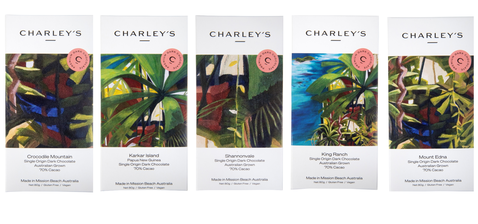
We took delivery of the 3 works. They were liked. A job well done by Kim. Then began the serious discussion of how to select the ‘slices’ from the pictures for the packages. A case of match our sub brands (single origin milk and dark, signature collection, chocolate with inclusions) with the art.
The challenge was to choose full slices for the plain chocolate. Having an open window of uniformly dark chocolate is not appealing. Then what about the wrap around slices for the see-through window bars?
Then our suggestions in mock up went off to the designer; who thought she had improving suggestions. More conversations.
Exhausted we finally settled on the slices. A few months project has now at least doubled; time is always a bit slower in FNQ, but really.
Next challenge. This was meant to be easier - selecting the actual packaging materials. The previous packaging (eg when you opened the bar) was not very customer friendly.
Fortunately, the field trip to Hawaii undertaken by your intrepid chair came up trumps. Some laughed - ‘business trip”!! But the packaging samples from Manoa Chocolate in Hawaii provided the inspiration for our packs. Starting with a recyclable cardboard square(ish), we fold it over and fix with a neat see thru sticker on the back of the pack.
Check out the different colours when you open a pack and the awards inside some packs. Plus the story. OK, you just ate the chocolate!!
The artist
Charley’s commissioned works from FNQ artist Kim Rayner, with the aim of showcasing FNQ and so linking Charley’s with its geographic origins.
The works Kim created for Charley’s
- Far North Queensland Islands and Rainforest Deep
- Wet Tropics Greens into Coral Sea Hues
- Mission Beach Feels
Read about Kim’s inspiration for her works here.

FNQ Islands and Rainforest Deep

Wet Tropics Greens into Coral Sea Hues

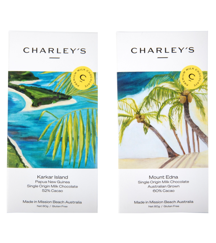
Mission Beach Feels
The Charley’s packaging
Single Origin Australian
Shannonvale, Mt Edna, Crocodile Mountain and King Ranch took slices from Far North Queensland Islands and Rainforest Deep
Two single origin milk chocolates - Mt Edna milk with 60% cocoa and Karkar Island milk with 52% cocoa took slices from Mission Beach Feels
Over to you the reader, to match the other bars to the works.
Additional information
Look here to see the images for the chocolates with inclusions
More of Kim's work